Email design
Email design 101: A guide to designing professional emails
Kristina Lauren
We’ve now talked about how to code emails from scratch and guided you through the difference between email coding and web coding, but now we’d like to guide you through how to actually design emails. From building the framework to testing out the final product, designing an email is an intricate process, so let’s break down some of the best practices.
Getting started
So, you want to design an email…but where do you begin? You may be wondering: should I sketch a layout, should I copy the format of emails from brands I really admire, or should I just start experimenting with a couple of ideas until something sticks? Of course, part of the email design process is discovering what works and what doesn’t, but it definitely helps to make sure you have the basics of your brand’s marketing standards down. That’s why you’ll want to start with an email audit. This first step will help you assess your brand’s long-term needs and properly define your project goals. To do this, you’ll need to gather some current emails, brand guidelines, and other marketing assets, such as logos and fonts, so that you can get a clearer picture of what essentially represents your visual brand.
From that point, you’ll be able to create a custom design system, which is basically a catalog containing all the graphic elements that you’ll use to build the design of your emails. This system will serve as a base and it can contain many elements from your email audit, from font styles to colors to icons.
As you come to learn more about your audience and your brand continues to grow, it will inevitably evolve and that means your visual standards will change as well. But you can save yourself a lot of frustration and keep your design process smooth by making your system as dynamic as possible. We recommend using a tool like Figma, which allows you to easily modify your catalog when it’s time for any makeovers or small adjustments.
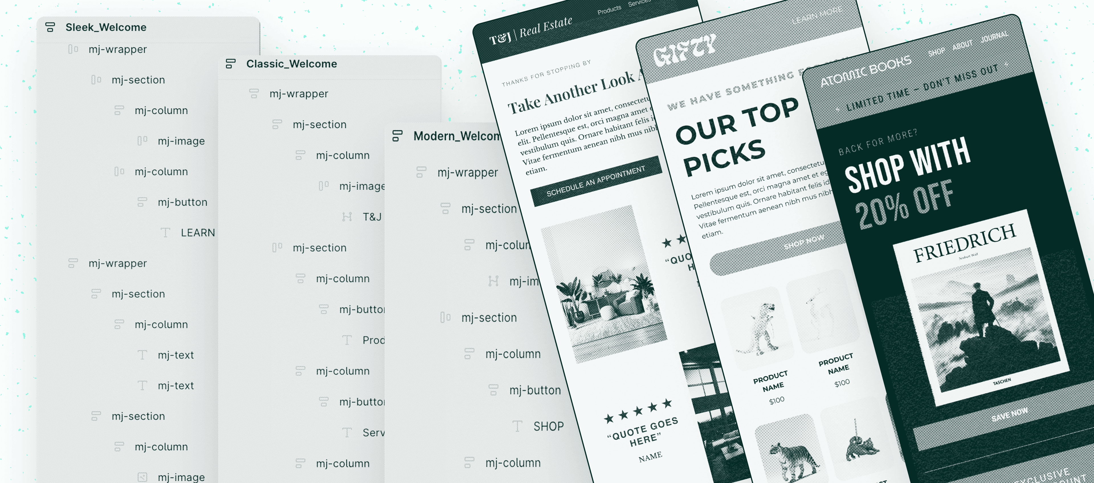
Take a look at an example design system using Figma:

Wireframes
Next come wireframes, which are skeletal outlines that serve to give an overview of your email structure. To have more flexibility when it comes to mixing and matching sections, we suggest employing a modular system, which enables you to use dynamic building blocks to create a variety of templates, allowing you to scale quickly by offering fresh emails using existing structure.
Once you create some mockups of your email from the wireframe and placeholder copy/graphics, you should have ready-to-use templates customized for your needs.
Your wireframe should look similar to this:

Common mistakes when designing emails
There is a method to the madness that is email design—and some rules just shouldn’t be broken.
Here’s a list of some mistakes we often see:
Lengthy emails that get cut off in certain email clients (Gmail, we’re looking at you).
No dark mode compatibility.
Inconsistent or confusing CTAs.
Poor mobile responsiveness (or none at all).
Lack of dynamic content.
Design ideas that don’t fit the brand.
Fonts that are hard to read or not email-safe.
Some of our customers are accustomed to using drag-and-drop editors to create their emails, which have their pros and cons. On the bright side, uploading images into an email editor instead of using code allows for sophisticated compositions. Some editors will also have more flexibility when it comes to utilizing unique fonts. On the flip side, sometimes these emails aren’t responsive for all email clients. There can be issues with image-loading speed, a lack of dark mode support, poor mobile rendering, and sometimes emails can just full-on crash on certain clients. These editors simply aren’t scalable.
This is why the goal should always be to create functional designs that are tailored to your audience’s needs, which includes optimizing for various devices and email clients. The result is a professional email design that is unique, scalable, and easy to work with.
Welcome to the Dark Side
Did you know 82.7% of users prefer dark mode over light mode? And for good reasons—dark mode reduces eye strain, it makes content stand out more, and thus, makes it easier to focus. Taking this all into consideration, you should design a complementary dark version of light mode emails and modify assets in the design system to help make sure they’ll render properly. You can see in the examples below how the same email appears in light vs dark mode:

Unfortunately, you can’t completely control how dark mode will display across every email client, which is why you’ll want to deal with any dark mode issues during the design phase. Here are a few good practices:
Ensure good readability of the text with simple, email-friendly fonts.
Colors should have a balanced contrast—stay away from saturated colors.
Avoid shadows and/or overlayed components.
Give all graphic elements a proper treatment (images with transparent backgrounds, icons and logos with thin, white strokes, etc.).
Make sure preferences for gifs adjust properly when exporting so that visualization is correct.
Rendering your email
At last, we arrive at every email developers’ “favorite” stage of the email building process—testing and rendering. Of course, you know how important it is to test any aspect of your brand before sending it out to your audience, but rendering emails is especially complex—a single design can have about 15,000 different potential renderings! The way your email displays all depends on the device, the email client, and the screen size, as well as the many combinations between these three factors.
Check out a few examples below to see the differences across mobile, web, and desktop.

What are some things to look for when rendering emails?
Incorrect or untracked links
Spelling, grammar, and punctuation errors
Broken images or images without alt-text
Font issues
Dark mode compatibility
Responsiveness across all screen sizes
Formatting issues between sections
Seemingly small mistakes in emails can compromise the trust audiences have in a brand, especially if those issues are consistent. The last thing you want your audience thinking is, “if they can’t get a simple email right, should I really have faith in their product or service?
The handoff
When the time comes to send your email off to your developers or to code emails yourself, Figma also makes the handoff process incredibly painless. This is because Figma makes it so that your design always comes across consistently and, as a result, you’re able to code components that are entirely reusable, saving you loads of time.
Figma also has an auto-layout feature that controls elements like padding and spacing and creates a more responsive design, especially because it can translate these elements into code and export exact assets in whichever format you need.

When designing, there is a lot to take into account throughout the entire creative process. Between gathering information to start a project, creating layouts, inputting content, and making sure that content is rendering properly, it’s easy to get tripped up, but now you should have a good understanding of the do’s and don’ts of email design.
However, because designing and creating emails is essentially what we do every day at Scalero, our designers and developers are quite skilled at the process. If you’re looking for more guidance or if you would like help with creating your own dynamic email templates, send us a message or signup for the Tiramisu app to get started!


