Designing for skimmability: Making emails easy to read

Most subscribers do not read your emails in full; they scan them. Users read only 20–28% of the text on a web page, and email is even less. Skimmability is not just a UX principle. It is a performance driver.
For lifecycle and CRM teams, designing for skimmability helps subscribers understand key information within seconds. The result is higher engagement, better click-through rates, and stronger conversion.
Why skimmability matters in lifecycle marketing
Every email competes with hundreds of others for attention. Subscribers spend an average of 8 seconds scanning an email before deciding whether to act.
Skimmable design helps your audience:
Grasp the main message quickly
Locate relevant content easily
Feel less overwhelmed by information
For lifecycle emails such as onboarding, cart reminders, and reactivation campaigns, clear hierarchy can determine whether someone converts or ignores your message. A skimmable layout is not only easier to read; it also feels more trustworthy.
The psychology behind scanning
Readers follow predictable eye movements when consuming digital content. Most scanning happens in an F-shaped pattern. People read across the top first, then move down the left side, occasionally pausing at bold or visual elements.
Designing for this behavior means structuring your emails with:
Short, descriptive headings
Visual anchors such as icons or CTAs
Ample spacing that guides the eye naturally
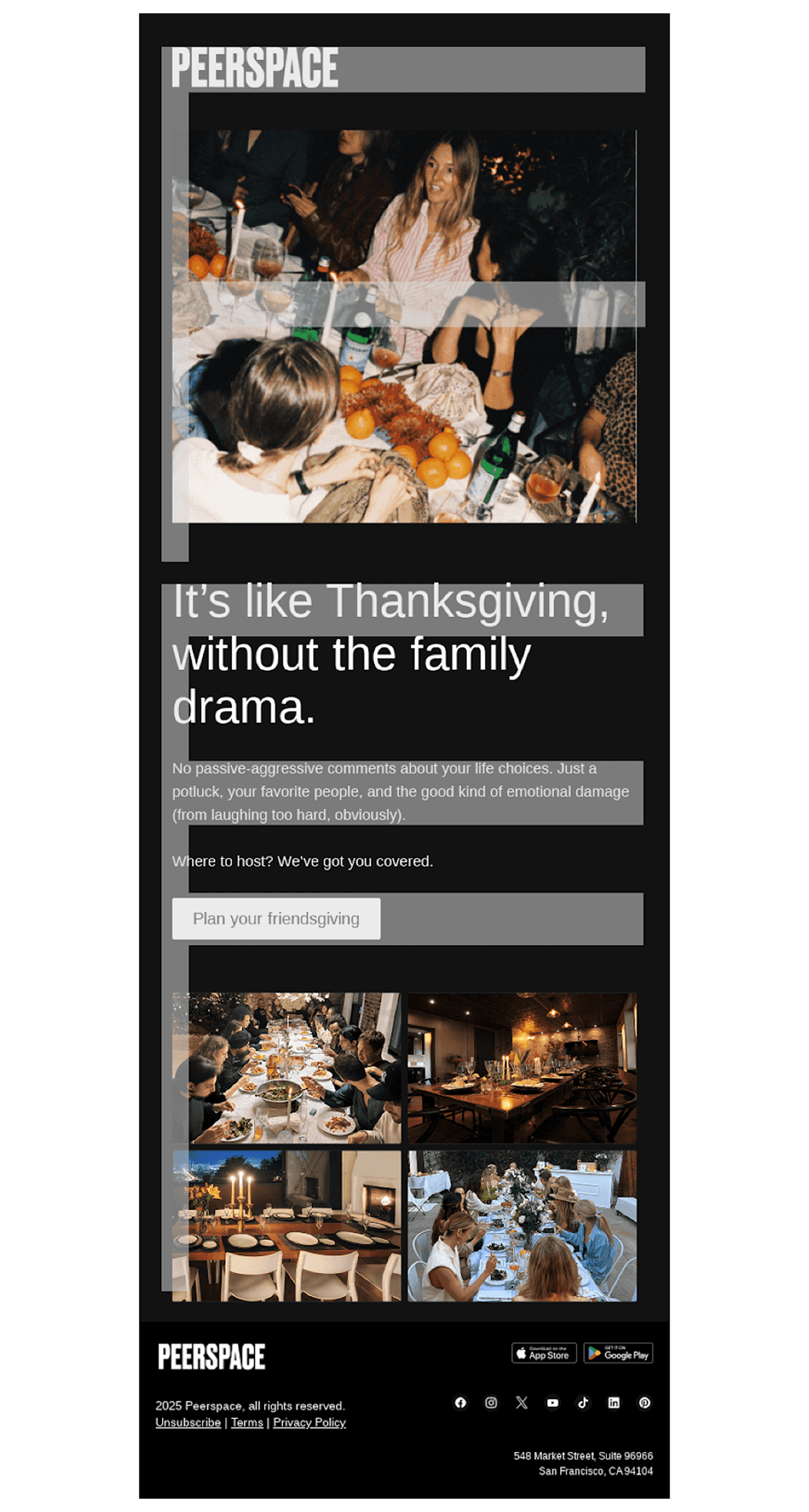
The Peerspace example follows this pattern effectively: the logo and hero image capture attention along the top bar of the “F,” the bold headline and short supporting text form the second horizontal line, and the vertical path down the left side naturally leads the reader to the CTA button and supporting imagery. This clear visual hierarchy keeps the flow intuitive and makes the message easy to absorb at a glance.
A skimmable email is built for how people actually read, not how we hope they will.
Design principles for skimmable emails
1. Prioritize visual hierarchy
Use hierarchy to communicate importance through size, contrast, and placement. Clear visual hierarchy can increase click-through rates by up to 35%, proving that clarity is as powerful as creativity.
Use larger headlines for key messages
Keep paragraphs under three lines
Separate sections with subheads or dividers
2. Use modular layouts
Modular design makes information easier to process. Each content block should stand alone both visually and contextually.
Keep one message or action per module
Alternate text and imagery for rhythm
Maintain consistent alignment and spacing
3. Optimize typography for scanning
Typography determines readability and tone.
Use clear font size differences between headers, body, and CTAs
Keep line spacing between 1.4x and 1.6x the font size
Limit line length to about 40–60 characters
4. Use color and imagery intentionally
Visuals should guide attention rather than compete with it.
Apply color to highlight CTAs or keywords
Choose images that reinforce your message; it might help to look at how they’re used in a few email examples
Keep backgrounds simple for better contrast
5. Design for mobile first
More than 70% of emails are opened on mobile devices. A skimmable design must function perfectly on small screens.
Use single-column layouts
Keep buttons large enough to tap easily (at least 44px tall)
Place critical information in the first 300px of the layout
Skimmability connects design and comprehension. When an email is structured for quick reading, your subscribers understand it faster and engage more often. Skimmability directly influences how well your audience absorbs information and acts on it.
The best lifecycle emails do not shout for attention. They earn it through clarity.


