From spooky to stunning: The role of visual design in seasonal emails

Seasons change, and so should your emails! Whether it’s pumpkins in October or snowflakes in December, seasonal campaigns are the perfect excuse to let your brand’s creativity shine. But there’s a fine line between “wow, that’s festive!” and “yikes, too much glitter.” The secret ingredient that keeps things balanced? Visual design.
Here’s how to make your seasonal emails look festive, on-brand, and polished:
1. Set the mood with color and imagery
Your email’s visuals should instantly say “Halloween fun!” or “cozy holiday vibes!” before a single line of copy is read.
Halloween: Go for deep purples, warm oranges, and eerie blacks; spooky, not sloppy.
Winter holidays: Use soft whites, golds, and deep greens for that nostalgic warmth.
Valentine’s Day: Mix reds and pinks with elegant typography for a romantic, modern look.
Example: The Bomb Co. uses bold oranges, black, and playful graphics to set an unmistakably spooky mood.
Why it works: It feels festive yet remains clean and consistent with the brand identity.
Scalero tip: Keep your seasonal designs consistent with your brand identity. Festive doesn’t mean forgetting who you are.

2. Add a dash of animation magic
A touch of motion can make your emails pop. Think of snow gently falling or a candle flickering. Animation brings energy, but too much can be, well, scary. Balance is everything.
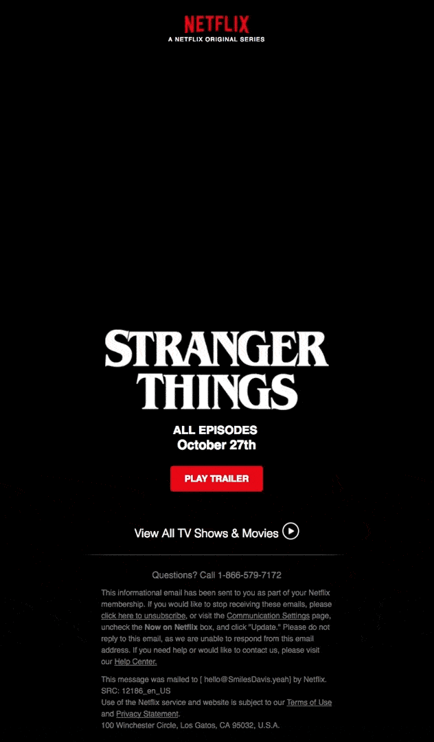
Example: Netflix’s Stranger Things email uses subtle dust particles and light flickers to create eerie movement.
Why it works: The animation adds atmosphere without distraction, enhancing the suspenseful tone of the series.
Scalero tip: If your email feels like a holiday light show gone wild, tone it down. Simple motion is memorable; chaos isn’t.
3. Design for flow, not just flair
A great layout helps your audience glide through your content, not get lost in it. Keep your hierarchy clear: headlines grab, subtext supports, CTAs shine.
Use white space to avoid clutter. Make sure your CTA buttons are easy to spot (no ghost-hunting required).
Example: Finn’s mobility email organizes information with clear hierarchy, balanced colors, and easy-to-scan sections.
Why it works: Clean flow and legible contrast make the content effortless to read.
When your email design flows naturally, your message feels effortless, and your subscribers are more likely to take action.

4. Tell a story through your design
Every season tells a story, and your visuals can too.
Halloween: Play with transformation and fun; from basic to boo-tiful.
Winter: Focus on warmth, connection, and a little sparkle.
Spring: Embrace renewal, freshness, and optimism.
Example: Day Out’s Halloween recipes turn a simple promotion into a cozy fall story using color and imagery.
Why it works: The design guides readers through an experience, not just a sale.

Example: Harry’s “A Hair-Raising How-To” uses illustration and humor to create a Halloween-inspired narrative.
Why it works: It tells a playful story that connects the product to the season naturally.
Your visuals should transport readers, not just inform them. That’s how you turn a campaign into an experience.

5. Keep accessibility in mind
A visually stunning email isn’t truly successful unless everyone can enjoy it. Use high-contrast text, clear fonts, and alt text for images. Accessibility isn’t just inclusive; it’s smart design.
Final takeaway
Seasonal emails are a playground for creativity. Done right, your design can capture attention, evoke emotion, and even boost conversions. From spooky to stunning, your visuals set the tone for the entire campaign and help your brand stay top of mind all year long.


